RADAR: COLOURS & STYLES
Radar improvement: Validate users’ preferences for radar colours and styles and finding out other associated information
Time: 2 weeks sprint
Project: Bureau of Meteorology Radar Improvement
Project team: Product owner, Scrum Master, Developers, UI designer
Goal: Validate colour and style preferences
Background
This research aims to validate possible bias from participants who are used to Bureau’s product. It will be conducted at Geospatial conference as a compact survey to validate and gain insights from public and also advanced radar users who are attending the conference.
Method
Online survey to find out users’ preferences for radar displays and associated information.
Attend 1 day conference for possible informal interview and observation.
What we wanted to find out:
Why and when the radar is used
What colour scheme is preferred
What radar style is most useful
Participants being presented 3 colour choices and 4 different radar styles along with open ended questions to find out the reason why they prefer a certain colour or style.
Not tested: Radar interactions on the timeline, specific data needs for the radar [emergency partners], radar loop, rain information, default view.
THE TEST
During the span of 2 days, people at the conference filled in a short survey at the Bureau’s exhibition stand. 37 out of 40 people finished the survey with completion rate of 89%.
Why and when the radar is used
Findings:
Participants are using the rain radar to see the movement and intensity of the rain for the purpose of:
General activity planning such as washing or riding and communicating
Personal interests and hobbies such as gardening
Analysis such as emergency response mapping, fire behaviour analysis and monitoring
Forecasting local weather
Other work related such aerial flight planning, research on land use change
60% of the participants use a radar multiple times during the week. 3% of the participants use it once a day.
What colour scheme is preferred

Colour palette 1 - Blue Purple
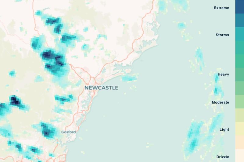
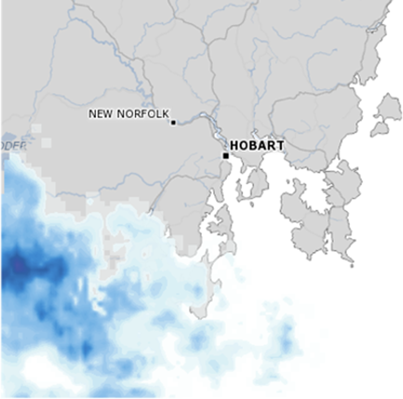
Colour palette 2 - Teal Green

Colour palette 3 - Rainbow
Findings:
88% prefer existing radar colours - Rainbow colour palette
Measure: 60% of participants choose one out of 4 as the preferred colour palette
7% of participants mentioned that they would like an option of new colours if the new colour options are distinguishable, have enough contrast and illustrates the intensity and severity. Blue-Purple colour scheme is being seen as a nicer colour but it might not illustrative the extreme events better. It is also about associating certain colour with what it illustrates; for example red is being associated with extreme and blue hues being seen as colour associated with rain.
Insights:
Majority of participants chose the existing radar colour. It is about having greater level of gradient of different colours than just being familiar with the existing colour scheme. Some other colour schemes are welcomed providing that it demonstrates strong contrast, illustrates intensity and severity and is distinguishable.
“You can clearly see where the rain is most intense”
A comment from a participant about why is one colour option is better than others
What RADAR STYLE is preferred


54% of participants chose Radar style Steps.
Measure: 60% of participants choose one out of 4 as the preferred radar style
“It seems to be the most definitive, hexagons are too generalised, dots is my second option though, it looks good as well.”
Findings:
44% or participants prefer radar style steps because it is easier to distinguish, it is more detailed and and it shows the amount of certainty or uncertainty. Small amount of participants mentioned that radar style steps are easy to understand and visually better and smoother.
24% prefer the blending style because it is being seen as visually better and smoother and shows better reference to base map.
16% of participants mentioned the importance of being able to see the landscape underneath and radar style circles is being perceived as one of the styles that answer this criteria.
6% of participant mentioned familiarity is the deciding factor when choosing a radar style.
Insights:
Half of the participants 54% favoured radar style steps (last image on the right). It is less about being familiar with certain style and more about having a more detailed representation of the rain, how distinguish and how quantifiable it is. Radar style steps is being perceived as having the combined qualities mentioned.
Recommendation
The research analysis resulted in colour and style ideal criteria to ensure both are suitable for the users.
Radar Colour:
When choosing new radar colour, it is recommended to consider the following criteria; colour should demonstrates strong contrast, illustrates intensity and severity and is distinguishable. For example the rainbow colours are being perceived as successful because it has all the criteria above. Any colours that has strong contrast preferably showing more colour steps are highly recommended - smooth gradations are to be avoid due to lack of contrast.
Radar Style:
When designing new style, it is recommended to consider the following criteria to ensure that a radar style should be visually distinguished, quantifiable and translate detailed interpretation of the weather. For example the steps styles are being chosen because it has the most suitable criteria although still needing improvement. It is recommended to use radar style steps with adjustments such as consider using added transparency to visually show details of the landscape underneath and changing the base map.
Next Steps
Discussed recommendation with UI designer to create the next version of radar improvement.
Presented findings, insights and recommendation at the end of the sprint to the team, product owner and other stakeholders.