RADAR: LOCATION MARKER
Radar improvement: Investigating user needs and preferences when using location markers
Time: 2 weeks sprint
Project: Bureau of Meteorology Radar improvement
Project team: Product owner, Scrum Master, Developers, UI designer
Background
This study aimed to provide insight on a user’s need from general public segment. It is to establish if there is a user need to see the current location and the location of where a user is going on the radar.
Primary Goal:
Do users need to see their current location and the location of where they are going on the radar?
Secondary Goal:
Do they know how to find or access the radar within the interface?
How do users determine their location within the radar? And how do they interact with it within the interface?
Method
Guerrilla usability testing is a rapid, low-cost method of capturing user feedback and to gain sufficient insights to make informed decisions or, in this case, demonstrate the value of a product to a particular customer segment.
Tasks completed as below:
Interacted with six people on the street.
Shown paper mock-up of radar on paper to provide feedback on the location markers concept - scenario based test.
At the end of the scenario based question, participants were asked if they could locate the radar using the existing design on a mobile device.
Video record the session.
Goals and Measure
Goal: Establish if there is a user need to see the current location and the location of where they are going on the radar.
Measure: If at least 70% of participants can demonstrate a use case in their daily life it will be considered a desirable function.
Participants of guerrilla testing
Total of seven people
What type of area do you live in?
71% Within a metropolitan city, 14% Outside a metropolitan city, 14% Prefer not to say
What is your age group?
29% 18-25, 29% 26-35, 14% 36-45, 14% 56-65, 29% Prefer not to say
What is your gender identity?
20% Female, 80% Male
Do you identify as a member of a CLAD community?
100% No
Do you identify as living with disability?
100% No
SCENARIO
You are going to ride from Melbourne to Geelong. You already know from the forecast that it is going to rain. You need to see where it is exactly raining currently along your journey so you can see which route is best.
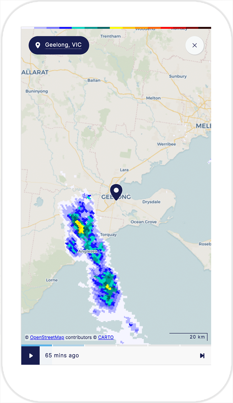
Mock up one: One location marker
One location marker
Findings
100% of participants expect to see the weather movement at their current location or location they selected on the radar. They would then adjust the view to see the area affected and look at the radar colours to work out the intensity.
"I expect to see the weather where I am now. So I expect to see the clouds at my current location if there are any."
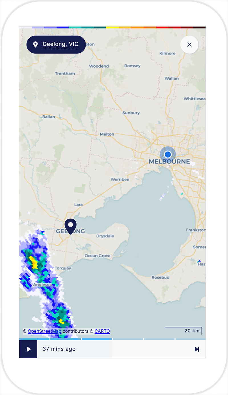
Mock up two: Two location markers
Two location markers
"I am not sure I feel much different. The journey in my head is still the same”
Findings
10% of participants would use this function on a rainy day to see where are they going and where is it going to rain. 10% of participants think that it is not useful. It doesn’t give an approximate travelling time and the distance of the rain. It was perceived as not giving enough information.
80% of participants mentioned that it would be useful for someone who doesn't know the location or not familiar with the area they are in. This is not being seen a necessity for themselves.
Other findings
Colour interpretation
Most participants understood the colours related to the intensity of the rain. Some participants demonstrated an understanding of certain colours means different severity e.g.: red means extreme.
Auto locate
20% of participants expected that their current location was automated.
Most participants understood the current location and destination pin icons on the radar and demonstrated familiarity with this design pattern used in other map functions.
Weather direction is most important
Participants demonstrated an understanding of where they are and the surrounding region. More than half of the participants did not demonstrate interest in how to get to their destination because they were already familiar with the location.
Participants were more interested at looking at the weather direction than their journey direction. Participants wanted to estimate the time taken to get to the destination and estimate where the rain is going within that time frame.
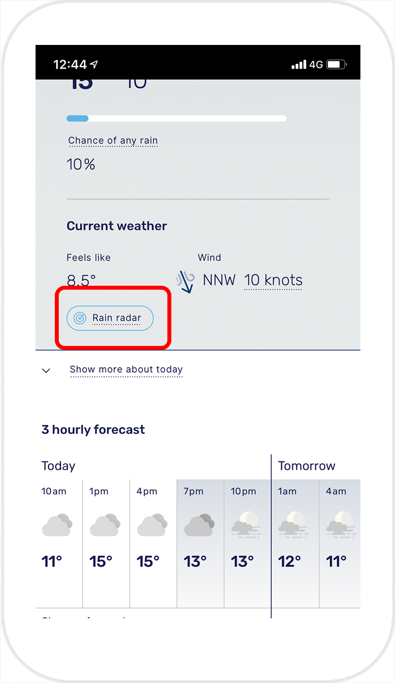
Accessing radar within the interface
When locating the radar within the interface, the majority of the participants scrolled down without stopping to use (or noticing) the button. One participant used the button to check if it went to the same place. Intuitively users scroll down to access radar.
Interaction
To interact with the radar map, the user must access the full screen. Most participants did not realise that the radar within the current beta is expandable. They tried to interact by using two fingers and pinching the radar in an attempt to zoom in and out.
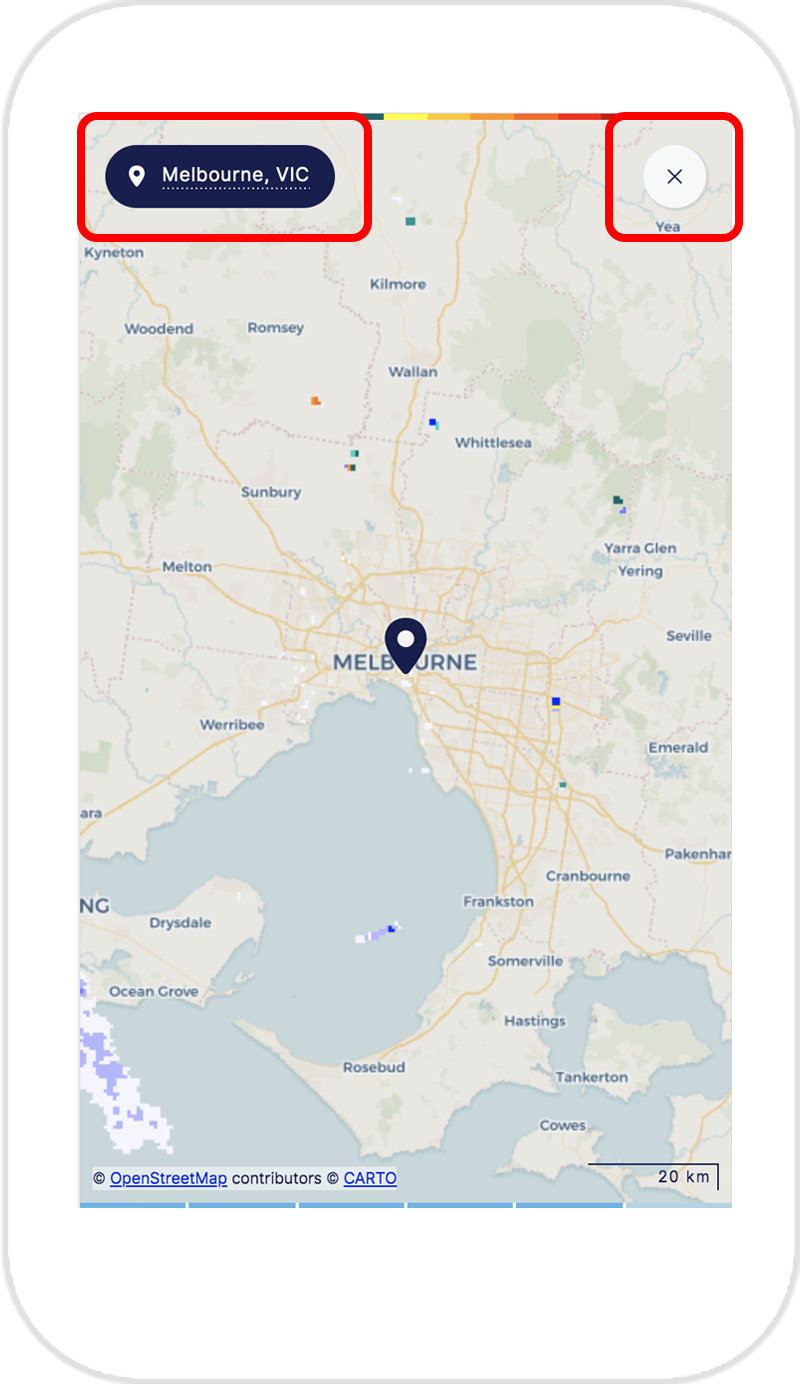
Location label
This element was supposed to function to tell the user their current location when they are in full screen mode. Participants tried to click on it, expecting that it will take them to the current location even though they assume it should be able to auto locate. Whilst not destructive it created confusion on what it is supposed to function as.
Before: Radar Button

Before: Radar preview
Before: Radar full screen access
Recommendations
Primary goal - locations makers
There was no strong indication that having two locations markers would significantly improve the user experience when using the radar. Most participants understood the concept but felt that not having it wouldn't have any impact on the way they interact with the radar.
Based on the findings and initial measure of 70% of participants can demonstrate a use case in their daily life; the recommendation for general public purposes would be to use one location marker.
Other recommendations - placement of radar button within the interface
Whilst not being seen as destructive the button to access the rain radar within the interface were proven being insignificant. From observation during testing, all 90% participants scrolled down as default. The button can be left as is as an added help but not affecting interaction within the interface.
Other recommendations - interaction (zoom in and out, location label)
Worked closely with UI designers. Some interface (visual) elements are to be changed. Some of the discussion points were:
Changed the enlarge icon to use stronger colour
Changed the location labelling visual to something simpler and make it look less clickable
When in fulls screen mode, ensure close button is consistent with the enlarge button

Improvement: Radar preview

Improvement: Radar full screen view