Mobile App
To create user-friendly mobile app for Brilliant Lighting first smart globe range. This was the first MVP and product Brilliant Lighting launched.
Timeline: 3 weeks
Team:
Product manager: Marie Cecile Lacoste
Graphic designer: Stephen Bettes
Role: Testing & Prototyping, Ideation, Art & visual directing and Documentation
The Challenge
The app is an existing app made specifically to suit overseas market but didn’t suit Australian market. With limited options on what can be done due to costing and efficiency, the user experience needs to be improved without changing the skeleton of the apps.
The app was developed by a developer overseas. They launched the first version and it was available - under a different brand - to be downloaded.
To Test
The initial step was to test the existing frame. We did a few user-testing on the app without any alteration to see what their thoughts.
“I don’t understand what level function is...”
Feedback
We had 8 users to test the app off the shelf without any alteration to see what they think. Unfortunately, the result was not very encouraging. The app came back with lots of discrepancies.
Area of improvement was:
Function - there are too many that users didn’t understand.
It takes awhile to sync the app to the globe.
Some of the ‘menu’ in the app didn’t make sense.
Iterate
Based on the collected feedback, I did some sketches to try and map the features and menu. Then storyboarding to try and understand user journey.

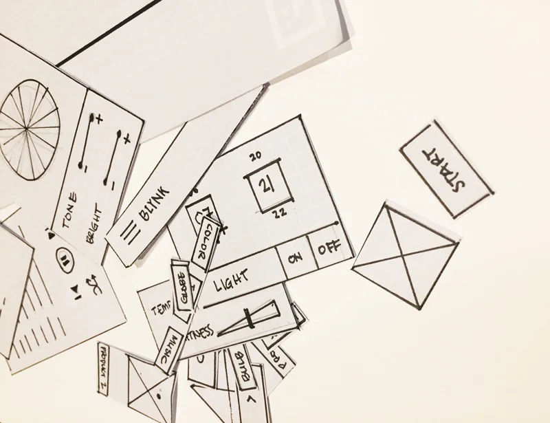
Prototyping
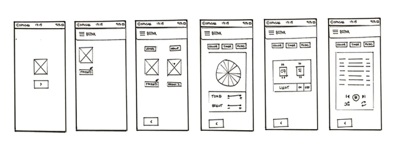
Based on the sketches - I created the wireframe and then paper prototyping. The test was quite simple. I showed them the paper prototype and set scenario - what would you do if you need to set up automated on/off function.
From this process, we were able to get some more insights:
Some of the menu namings still required more improvements.
Some function is not needed at all, such as warmth or ambiance - overlapping with colour tone.
There was some confusion on what ‘grouping’ means.
Lack of interest from getting through the steps - too many steps to do one thing.
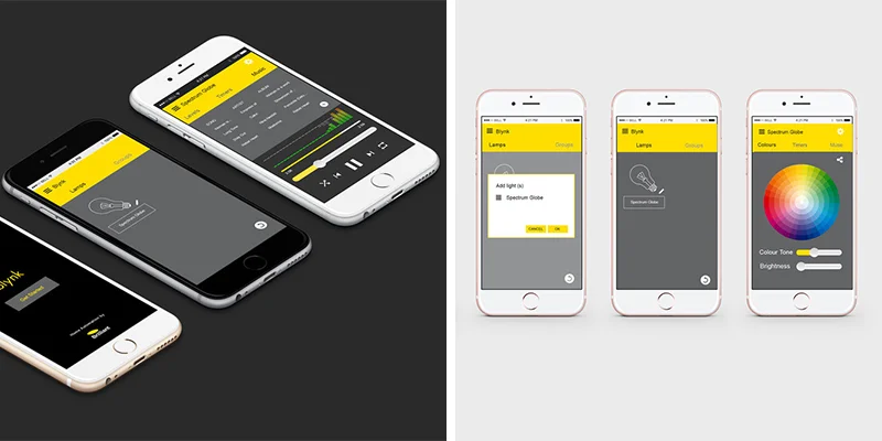
Visual design
Due to time constraints and budget, we needed to move on with our first version. worked together with another graphic designer, we did the UI and submitted to developer overseas. Branding came in at this stage and used as the style throughout the app.
... to improve current version, we need to do further interview and test to gain more insights.
Below are also some of the to-do lists I recommended to be worked on for the next version:
User-test the app further - preferably with customers at the store level.
Get some more user insights on what features they would like to see in addition to the current basic functionality. The original features from the developer of this app were not very well received by users - causing them being dropped from the app.
Work with the developer to further improve ‘music’ and ‘group’ feature.
‘Group’ feature is one of the more confusing functions that we noted at the testing stage. Not being able to ideate on that, obviously making the function become redundant. At the final stage, we decided to leave out this function and add that on for the app version.